Assistant Scenic Design
Under Jeni O’Malley
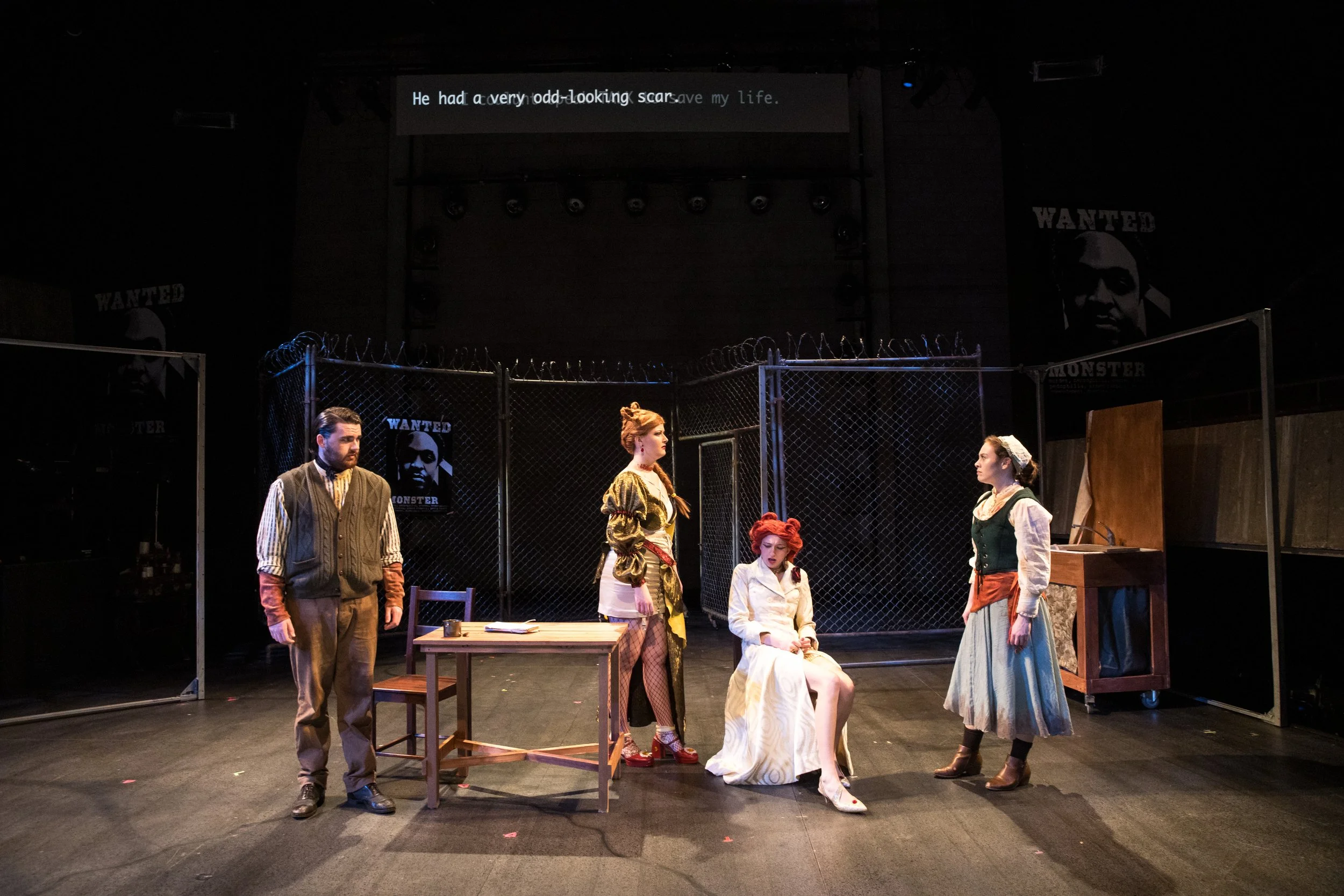
I was brought on initially, due to my Graphic Design background, the show required super titles for a language and my Scenic Design Professor at the time thought that I’d be a helpful to her.
I also ended up designing a Wanted Poster, Flag, and the Floor elevation, along with gathering research.


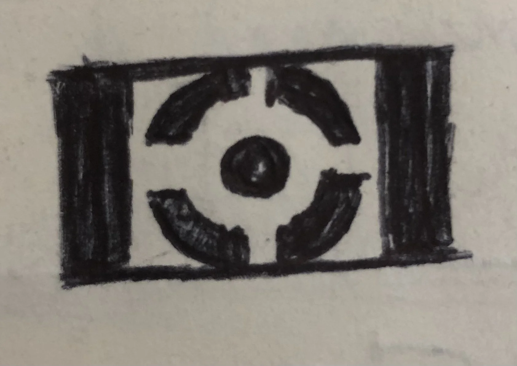


The Flag
The initial plan for the Flag was to have it also be made into a gobo, which means it had to recognizable in black and white and had to be stencil-able.
It also needed to feel oppressive but not blatantly and not particularly linked to any country.

There were numerus rounds of sketching with feedback from the Director and my Designer. Resulting in the design below.
The Poster
The poster’s copy was predetermined by the script so I didn’t have to write anything, thank goodness. Another thing that was already cut out for me was the formatting, wanted posters tend to be pretty much all the same.
All I really had to worry about was the style, I played around with the portrait of the actor playing Monster in Photoshop and did multiple takes on the design.
We ended up settling on the black and white rendition with the flag in the background and a distressed type for the title case and a typewriter font for the body.


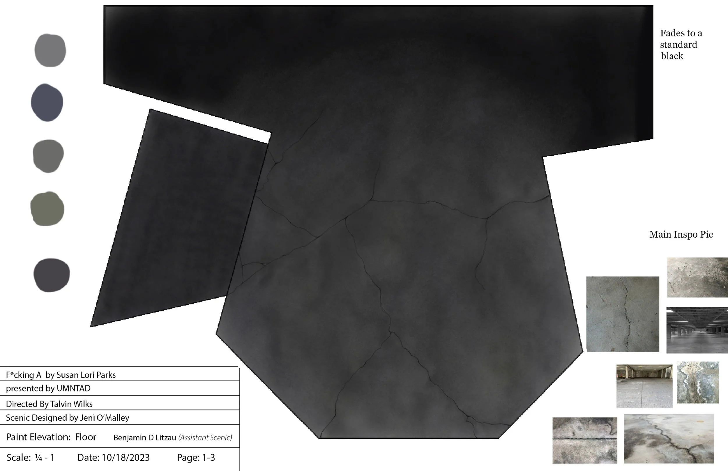
The Floor
The main goal of the paint elevation was to save money. My designer wanted me to use paints that we already had in stock.
I started by briefly talking to my designer about what she was wanting and concrete seemed like a good move. I then found a some reference photos that would provide our charge artist with a clear idea of what I was aiming for.
Finally I digitally painted it out, and provided a close up as well.